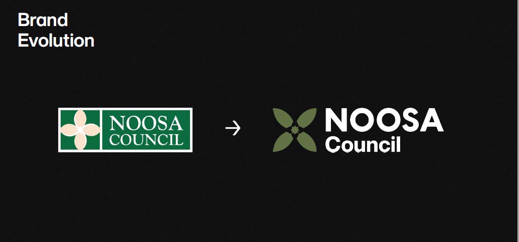
A new council logo is part of a refreshed council brand that is more accessible for the visually impaired and “articulates the aspirations of Noosa”.
At this week’s General Committee meeting, councillors agreed that after 30 years and to complement the soon-to-be released Corporate Plan, an opportunity existed to undergo a brand refresh for the organisation.
It was expected to be formally ratified at the Ordinary Meeting.
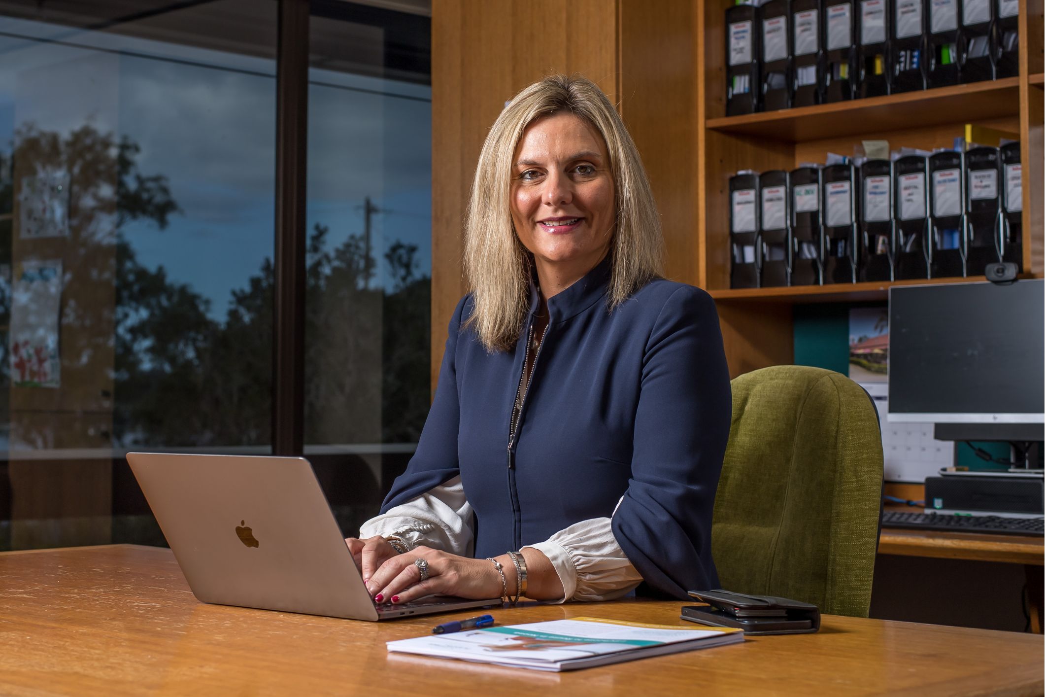
CEO Scott Waters said the Corporate Plan was a legislative requirement and, given the extensive work on developing a new blueprint for the council, it was timely to implement a more modern, flexible refresh of the brand.
“The previous logo and branding has certainly served the organisation well, but as we move to an agile, contemporary organisation, it’s important to respect the past and acknowledge the modern, professional approach of this council,” he said.
“This work, at a cost of $60,000, has been done within the existing Corporate Plan budget and has had no impact on any other programs or initiatives.
“The change really allows us as a major employer in the shire to show who we are, what we deliver and what we value.”

Mayor Clare Stewart said the evolution of the brand had been truly a local affair with Peregian Beach-based business Saturate providing its expertise.
“This work is part of the extensive CEO Roadmap, endorsed by councillors last year,” she said.
“As an organisation, we continue to evolve beyond the pandemic to become a vibrant, progressive and agile council without losing sight of the things that make us unique.”
Mr Waters said this was another key component of the extensive Noosa 2.0 change management program being rolled out across the organisation.
The brand refresh has been designed to respect the integrity of the signature Boronia wildflower, which was part of the 1990 design. However, consultants have provided a refreshed image and identity that clearly portrays a modern, agile and customer-centric organisation.

“This has been done within existing budgets, respects the integrity of the past and Saturate have done an exceptional job in representing our landscape, shire and natural environment,” Ms Stewart said.
The process included in-depth research and analysis of existing council strategies and results from the Liveability Survey by design consultants Saturate. A series of internal workshops helped inform the development of a unified brand strategy and architecture.
“It was about leveraging off what makes Noosa unique, welcoming and recognising the past,” Mr Waters said.
He said council would implement the refreshed brand on a gradual basis as it replaced supplies, equipment and signage.
“We are taking a conservative, cost-conscious approach to the rollout. However, elements such as the website and social media accounts will be changed immediately,” he said.
Do you have an opinion to share? Submit a Letter to the Editor at Sunshine Coast News via: news@sunshinecoastnews.com.au. You must include your name and suburb.


